When Preferences Become Marketing Faux Pas


So, you're paying for a website. You want to get the most out of it, right? Plus, you want it to be YOUR website. You have specific ideas in mind from the color scheme to the images and words on each page. And let's face it – the design is the fun part! Much like decorating a home, it's your chance to express yourself in a variety of ways. Unfortunately, your personal preferences could be damaging your marketing strategy.
There are a lot of ways you can damage your online presence that have nothing to do with optimization, as we've addressed in a few recent articles (like why you shouldn't use a personal email address to communicate with your clients). Yet these factors can severely hurt your overall marketing efforts. Letting personal preferences get in the way of an eye-pleasing website design is one of them.
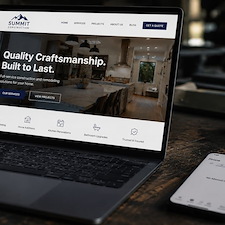
You are paying for marketing services to reach out to potential clients and get them to visit your website with the ultimate goal of them contacting you for service. So try to think of your website like a house you're trying to sell. After all, you're trying to sell your company's services.
Treat Your Website like a House You're Trying to Sell
Much like real estate that's been listed on the market, the goal of your website's design is to get potential clients to look around for a while and make inquiries. A house with an exterior that's been painted bright purple with broken plastic pink flamingos littering the yard is doubtful to make a good first impression. In fact, it's likely to send potential buyers quickly moving on to the next house. Don't let the same be said about your website, (even if you LIKE yard flamingos...we won't lie, being in Florida, we're pretty partial to them, too).
A good rule of thumb to follow with both houses and website designs is subtly. This is why neutral tones are such a safe bet. Afraid that will make your website look boring? There are plenty of ways our designers can help you add drama to your website with graphics and pops of accent colors. The "less is more" rule usually applies to bright, bold colors in website designs, so try to avoid the use of eye-blinding hues in, for example, backgrounds or prominent images like banners.
So while you may love that neon green background or bright, bold red color scheme, it could be deterring traffic from your website. How do you expect potential clients to stay long enough to fill out your online form if they are immediately turned off by an eye-straining color scheme they can't stand to look at?
We encourage you to be creative with your website's layout, and our designers are delighted to help you by creating a unique design customized to your company's image and marketing goals. But we're also here to guide you in making better choices for your overall marketing strategy. While your website should definitely be a reflection of you and your business, keep in mind it's not like an outfit you wear out on the town to express yourself. It's more like a billboard. Your focus should be toward making your website appealing to your visitors.
Don't Send Your Website Design Spiraling into the Past
There's a reason fashion from the 80's went out of style and only comes out in the form of theme parties (or eccentric fashionistas). Wild arena hair and neon colored clothing can be fun – in small doses. Not many people run around in bright yellow spandex and tight fitting acid wash jeans anymore...why do the equivalent to your website?
The goal of a good website design should be to engage your target audience and keep them on your website – not chase them away with audaciously bright colors and gaudy graphics. Do you remember websites from the early 90's? They had gaudy backgrounds, pixelated images, and goofy, animated, clipart-style gifs. Many people look back on those old designs and laugh.
Computer graphics and website designs have come a long way since then, and instead of laughable layouts you can have a sleek, professional, modern design that is attractive while still being unique and personal. Let's make sure your website design doesn't become a meme... let the professional website designers and experienced graphic artists at Footbridge Media guide you through the layout process for your new website, overhaul or other graphic design needs.
![]()

About Aaron O'Hanlon
Aaron O'Hanlon is the CEO and Co-Founder of Footbridge Media, a digital marketing agency, specializing in the contracting industry. It is his mission to create awareness of marketing online to the home improvement industry and to educate, inform, and assist contractors in taking over their own online presence.