6 Contractor Marketing Web Design Mistakes


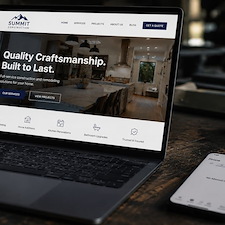
Your website's content is carefully planned out, created with useful information that will appeal to people and search engines alike. But getting clients to your site is just the first step. When prospective customers get to your page, it is important to deliver a visually appealing and easy to use web site. Our design team works diligently to deliver a combination of style and science to your site design; This creates a site that looks great, that users will understand, and that will direct people to click and contact you. Occasionally, we get design requests that we flat out recommend against, to make sure that we can deliver the best product possible to generate leads for your business. Here are six samples of common contractor marketing web design mistakes.
It Needs More Buttons: Too Many Confusing Call-to-Actions
Now more than ever, people are aware they are constantly being advertised to and sold to on the internet. Having too many buttons looks spammy and doesn't generate results. The reason for this is the overstimulation, creating too much choice adversely affects converting users to customers. In the end, a few well placed buttons and call to actions are acceptable – They should generally be placed in the the header, middle/sidebar, and bottom of your content.
Make It All Red!: Too Much Contrast
The human brain is hardwired to pay attention to contrast and discover elements of design that break patterns. While one big friendly red button on a white page calls attention, adding more red throughout the page means there is less contrast. Adding too much red makes red the "normal" color of the page. The most important elements of your page should have the best contrasting color, such as your phone number or a contact button. By limiting the amount of contrasting colors to specific areas where you really want to draw in the client ensures the effectiveness of those elements.
Ignoring Link Style Norms
We've developed cultural norms for how the web should look. The average user understands that images or text that change color when hovered are most likely a link. Similarly, text that is underlined and/or bold, in a color other than the regular body text color throughout the design, is most likely a link. Attributing these styles to images and text that are NOT links confuses the user, and makes your site more difficult to navigate and understand. On the flip side, removing these style distinctions from actual links may hurt your page. An old black hat, or unethical, SEO trick was to add mass amounts of keywords in white colored text on a white background. The space would appear blank to the user, but search engines would find the information and consider it when ranking the page. Search engines have since become much more savvy, and can tell when you're trying to game the system. Links that don't really look like links may be considered "deceptive links" and may negatively impact your site's ranking.
I Love The 90's: Old Design Trends
It is time to let go of vintage web site design. The usual suspects of early internet design includes elements like white text on black backgrounds, blinking buttons, dancing .gif files, and site visitor counters. These style elements can make your site look old and out of date. Just like a well maintained lawn and curb appeal makes a home look more inviting, a well maintained, update-to-date website and online presence conveys trustworthiness.
Over Complicated Forms
Long or multi-page forms have their place, such as employment forms, financing agreements, or other applications where users understand it is vital to supply great deals of information. But the longer the form, the less likely it will be filled out. Do you really need to know your customer's full home address, home phone number, mobile phone number, work phone number, email address, and written comments in your "Quick Quote" form? Giving your customers an easy way to contact you, with as little resistance as possible, will lead to increased conversion rates. For fast forms, consider taking the visitor's name, phone number, email, and perhaps a dropdown menu where they can select one of your services. Only make information required if you MUST have to complete the next step of the sales process.
Forgetting About Mobile Devices – Responsive Design
With more users on the mobile web, it is vital that your web site is ready for customers viewing on smartphones, tablets, and netbooks. Having a site that works great on desktop but fails on small devices ignores a significant part of your potential client base. Using responsive web design will ensure your web site functions properly on any screen size. Make sure that specific elements, like "tap to call" phone numbers, are in place so that visitors can quickly contact you.
![]()

About Chris Lonergan
Chris Lonergan has over 13 years of contractor marketing experience with Footbridge Media. With a background in web design, print design, content creation, and online marketing, Chris is focused on providing quality marketing and business solutions in the construction and service industries - helping small business owners to more efficiently manage their companies and grow their operations.
Chris Lonergan has previously contributed to and/or been featured in PM Magazine (Plumbing & Mechanical | Contractors x Engineers), theNEWS (ACHR - Air Conditioning | Heating | Refrigeration), Turf Magazine (For Landscaping and Green Industry Professionals) Service Roundtable's blog, inPAINT Magazine, the SMB Marketing Agency Show, and the Green Industry Podcast. Chris is also a past SGI/CertainPath breakout session presenter.