Mobile First: the Growing on the Go Search Market


The on-the-go search market continues to grow – Google has acknowledged that over 50% of search queries around the world happen via a mobile device. If your website doesn't work for mobile users, it means your website doesn't work well for the majority of internet users. You wouldn't hang up on 50% of your customers calling your phone and you wouldn't delete 50% of those lead generation emails from your website – so why would you ignore more than 50% of your potential customer pool by having a website from the pre-mobile era.
The End is Nigh!
Starting in April 2015, Google updated their algorithm in an effort to push webmasters to update their sites. The update was originally thought to be a punitive change – meant to dramatically reduce rankings for websites that were not optimized for mobile devices. Google's mobilegeddon didn't immediately trash site rankings as punishment for not being mobile friendly. While there were some noted reductions in ranking for some users, over time Google's update seemed to do more to reward mobile-friendly website over time – displaying Breadcrumbs / reviews / phone numbers in a more visually appealing way. Websites that are not mobile friendly will likely continue to drop over time, especially considering additional updates to the algorithm the future...
Mobile First Index
The web moves pretty fast. If you don't stop to look around every once and awhile, you might miss it. So first – some history on the mobile web.
When simple mobile devices were able to access the internet, you were on the cutting edge if you had a separate mobile page for phone users to view (usually m.domain.com). Five or six years ago, Google started its recommendations for "responsive design" – saying that the optimal configuration for a website is a single page that is designed for multiple screen sizes. During this entire time, Google has still being crawling the "Desktop" version of the website when determining how to rank pages.
The most recent mobile design trend is Mobile First Design, which takes traditional "responsive design" and turns it on its head. Instead of designing for desktops and then "scaling down", developers and designers build sites with the smallest screen size as the priority – and then "scaling up" to tablets and desktops. The idea makes sense, when the smallest devices generally have slower processing power than their desktop counterparts.
Google also realized that it makes sense to evaluate websites on their "mobile" content when the searcher is mobile. In late 2016, Google started its own "mobile index" experiment, with rumors such an update to Google algorithm could go live in 2018.
The Takeaway
While prospective algorithm changes are always underfoot and subject to change, it makes sense now more than ever – given the number of mobile searchers – that Google would want to serve the most relevant search results possible. Stay ahead of the curve by ensuring that your site code is ready for mobile traffic and On The Go Search Market.
Not Being Mobile Friendly – Design / User Experience Impact
All technical and search engine optimization aside, a site that is not mobile friendly doesn't present your business well to your on-the-go potential customers.
Ugly or Broken Design
Having the traverse a website designed for desktops is just plain annoying on mobile devices. Best case scenario, your prospective customers have to "pinch and zoom" to see read your site content. Worst case scenario, your would-be customers cannot access your menu or the design "breaks" for mobile devices, becoming unviewable. Either way, ignoring the on the go search market means ignoring those users.
User Experience and Interaction
Viewing a website on a larger screen means you can use a keyboard and mouse to interact with a page – so that users can click, hover, and type to their hearts content. The only tools available to most mobile users are their fingertips – so you've got to make mobile websites that take this into account. Not having a mobile-first or at least mobile friendly website means that you won't be able to "tap" phone numbers to open up your smartphone dialer to start a call. Where a mouse could hover over specific areas of interaction, your mobile design must keep "tap target" size (the area in which an action could be initiated via a touchscreen device) in mind.
The Takeaway
Ugly and broken sites scare away visitors. If your site design isn't cutting it for phone and tablet users, they will bounce from your site and back to the search engine results page to find another business that is more easy to work with.
Don't Miss Out on the Growing On-the-Go Search Market
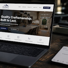
Whether we are talking about the search engine optimization aspect or the design / user experience – you are losing lead opportunities. If your website is with Footbridge Media, your site is either responsive or build "mobile first". If it is neither of those, your account manager would have already talked to you about this issue and offered solutions. If you use another provider, you can ask them if your website is "mobile first". If they don't know, consider using Footbridge Media for your business website – all the sites we build are currently in the "Mobile First" format.

About Chris Lonergan
Chris Lonergan has over 13 years of contractor marketing experience with Footbridge Media. With a background in web design, print design, content creation, and online marketing, Chris is focused on providing quality marketing and business solutions in the construction and service industries - helping small business owners to more efficiently manage their companies and grow their operations.
Chris Lonergan has previously contributed to and/or been featured in PM Magazine (Plumbing & Mechanical | Contractors x Engineers), theNEWS (ACHR - Air Conditioning | Heating | Refrigeration), Turf Magazine (For Landscaping and Green Industry Professionals) Service Roundtable's blog, inPAINT Magazine, the SMB Marketing Agency Show, and the Green Industry Podcast. Chris is also a past SGI/CertainPath breakout session presenter.